The Ultimate Guide to Mobile-First Web Design Best Practices in 2025

Introduction
In today’s digital landscape, mobile-first web design is no longer an option—it’s a necessity. With over half of global web traffic coming from mobile devices, businesses must prioritize mobile-friendly experiences to stay competitive. Google’s mobile-first indexing further reinforces the importance of responsive and user-centric design. As we move into 2025, adopting best practices for mobile-first web design ensures websites deliver seamless, engaging, and high-performing experiences across all devices.
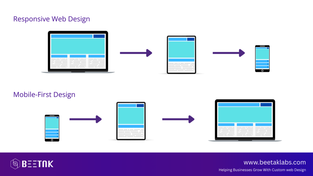
Understanding Mobile-First Design
Mobile-first design is an approach that prioritizes the mobile experience before scaling up to larger screens. Unlike traditional responsive design, which starts with desktop layouts and adapts them for smaller screens, mobile-first design begins with the constraints of mobile devices and progressively enhances the experience for tablets and desktops. This methodology ensures optimal usability, faster load times, and better engagement for mobile users, who now represent the majority of online visitors.
Prioritizing Speed and Performance
Page speed is critical in mobile-first design. Slow-loading websites frustrate users and lead to higher bounce rates. Google considers page speed a ranking factor, making performance optimization essential for SEO. To enhance loading times, websites should utilize lightweight code, optimize images, and implement modern web technologies such as lazy loading and content delivery networks (CDNs). Reducing unnecessary scripts, leveraging browser caching, and using compressed file formats further improve speed without compromising quality.
Implementing Responsive and Flexible Layouts
A mobile-first approach requires flexible layouts that adapt to various screen sizes and resolutions. Fluid grids, scalable typography, and CSS media queries help maintain consistency across devices. Instead of fixed pixel-based dimensions, using relative units like percentages and ems ensures elements resize proportionally. Breakpoints should be strategically placed to accommodate different screen sizes without disrupting the user experience. The goal is to provide a seamless transition between mobile, tablet, and desktop views without compromising readability or functionality.
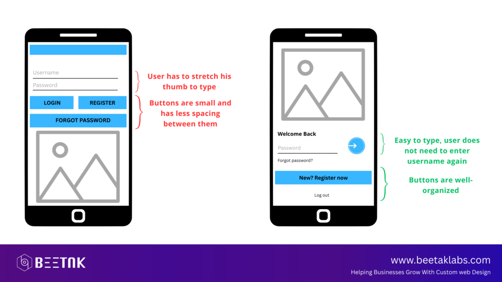
Designing for Touch Interaction
Unlike desktop users who navigate with a mouse and keyboard, mobile users rely on touchscreens. This shift demands careful consideration of button sizes, spacing, and interactive elements. Buttons should be large enough for easy tapping, avoiding frustration from accidental clicks. Forms should be simplified with auto-fill options, clear labels, and minimal input fields to reduce user effort. Interactive elements like sliders and dropdown menus should be optimized for touch gestures, ensuring smooth and intuitive navigation.
Optimizing Images and Multimedia for Mobile
High-resolution images and multimedia content can slow down mobile pages if not properly optimized. Using modern image formats such as WebP reduces file sizes while maintaining quality. Implementing responsive images with srcset attributes ensures different resolutions load based on device capabilities, preventing unnecessary bandwidth usage. Video content should be optimized for mobile streaming with adaptive bitrate technology, allowing smooth playback on varying network speeds. Auto-playing videos should be used sparingly, with user controls for accessibility.
Learn how to optimize images effectively with Google’s WebP Guide.
Focusing on Mobile SEO and Core Web Vitals
SEO plays a crucial role in mobile-first design, ensuring websites rank well in search results. Google’s Core Web Vitals emphasize key performance metrics such as Largest Contentful Paint (LCP), First Input Delay (FID), and Cumulative Layout Shift (CLS). Optimizing for these factors improves page experience, reducing frustration caused by slow responses and layout shifts. Mobile-friendly URLs, structured data, and proper metadata enhance visibility, while fast-loading AMP (Accelerated Mobile Pages) can further boost rankings.
Enhancing Readability and Visual Hierarchy
Content readability is a crucial aspect of mobile-first design. Small screens require well-structured text with clear hierarchy and spacing. Font sizes should be legible without zooming, with line heights optimized for readability. Short paragraphs, concise sentences, and strategic use of headings improve scannability, allowing users to quickly find relevant information. Contrast between text and background should be carefully balanced to ensure readability in various lighting conditions. Avoiding excessive text blocks and prioritizing whitespace improves overall visual clarity.

Ensuring Accessibility for All Users
Web accessibility is essential in mobile-first design, ensuring inclusivity for users with disabilities. Implementing proper alt text for images, keyboard navigability, and voice command compatibility improves usability. Color contrast should meet WCAG guidelines to assist visually impaired users. Dynamic font resizing and screen reader support enhance accessibility, making content more navigable. Designing with accessibility in mind not only improves user experience but also aligns with legal requirements in various regions.
Simplifying Navigation and User Journeys
Navigation should be intuitive, allowing users to access content effortlessly. Mobile menus should be streamlined, avoiding cluttered dropdowns that overwhelm users. Sticky navigation bars enhance usability, keeping important links accessible without excessive scrolling. Breadcrumbs and search functionality help users locate information quickly. Call-to-action buttons should be strategically placed, guiding users toward conversions without intrusive pop-ups that disrupt the experience.
For more web design insights, explore our post on 10 Must-Have Features for a High-Performing Business Website.
Leveraging Progressive Web Apps (PWAs)
Progressive Web Apps (PWAs) are revolutionizing mobile-first experiences by combining the best of web and app functionalities. These lightweight applications offer offline access, push notifications, and faster load times compared to traditional websites. PWAs eliminate the need for users to download separate apps, providing a seamless browsing experience while improving engagement and retention. As mobile browsing continues to dominate, integrating PWA capabilities enhances user satisfaction and boosts conversions.
Future Trends in Mobile-First Web Design
The evolution of mobile-first design will continue in 2025 with emerging trends such as AI-driven personalization, voice search optimization, and dark mode UI. Artificial intelligence will enable more tailored user experiences, adapting content dynamically based on browsing behavior. Voice search-friendly content, structured for conversational queries, will play a significant role in SEO. Dark mode will gain further popularity, offering an alternative visual experience that reduces eye strain and conserves battery life on OLED screens.
Conclusion
Mobile-first web design is the foundation of a successful digital strategy in 2025. Prioritizing speed, accessibility, responsive layouts, and touch-friendly interfaces ensures a seamless user experience. By implementing SEO best practices, optimizing multimedia content, and embracing emerging technologies like PWAs, businesses can stay ahead of the competition. A well-designed mobile experience not only enhances engagement but also drives conversions, making mobile-first design an essential component of modern web development.
For more insights, read our guide on The Ultimate Guide to Website Accessibility and start optimizing your website today!
You Might Also Be Interested in

Essential E-Commerce Security Tips to Protect Your Store

How to Build a Strong Brand Identity Through Your Website