Introduction
Color is one of the most powerful tools in web design. It evokes emotions, influences perceptions, and can drive user behavior. In fact, studies have shown that color can increase brand recognition by up to 80%. When strategically used, color can enhance user experience, improve website conversions, and build a strong emotional connection with visitors. In this article, we’ll explore how color psychology impacts web design and the role it plays in shaping user behavior.
The Emotional Impact of Color
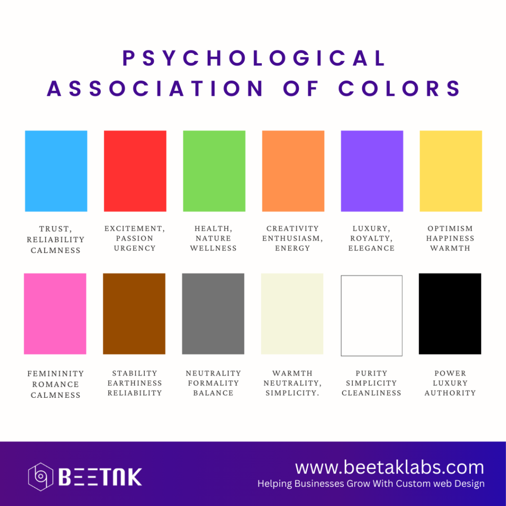
Each color carries a unique psychological association. For instance, blue is often linked with trust, reliability, and calmness, making it a popular choice for financial institutions and tech companies. On the other hand, red is associated with excitement, passion, and urgency, making it ideal for call-to-action buttons or sales promotions. Colors like green are known for their calming effects and are often used by brands promoting health, nature, or wellness.

Understanding how different colors affect emotions and perceptions allows designers to align color choices with the intended message or brand identity. For example, a website promoting eco-friendly products might use green to convey sustainability and calmness, while a high-energy fitness brand may opt for orange or red to evoke excitement and motivation.
Color and User Engagement
Color also plays a significant role in user engagement. Studies have shown that the right use of color can keep visitors on your website longer and encourage them to interact with key elements. Contrast is crucial for readability. High contrast between text and background colors ensures that content is easy to read, which can reduce bounce rates and improve user retention. On the other hand, low contrast might make text harder to read, causing frustration and leading to users leaving the site prematurely.
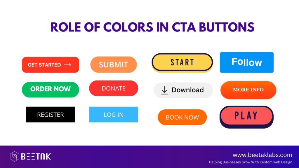
In addition, color can help highlight important sections, like call-to-action (CTA) buttons. A well-placed bright, contrasting color for a CTA button, such as orange or green, can increase conversion rates by drawing attention to the action you want users to take. Conversely, using too many bright colors at once may overwhelm users and reduce the overall user experience.
Color and Branding
The relationship between color and branding is inseparable. Many successful brands, such as Coca-Cola, Nike, and Apple, have built their identities around specific colors that align with their brand values. Color consistency across all digital and physical marketing materials is key to reinforcing brand identity and building trust with the audience.
When designing a website, it’s important to consider the psychological meaning of colors in the context of your brand. For example, if your brand aims to communicate sophistication, luxury, or elegance, using a combination of black, gold, and white can help reinforce that image. A brand focused on happiness, creativity, or playfulness might lean toward yellow and orange tones to project optimism.
The Role of Color in Conversion Rates
Beyond aesthetics, color can significantly impact a website’s conversion rate. A website with a cohesive color palette that aligns with user expectations is more likely to encourage action. CTA buttons are one of the most common areas where color plays a vital role in conversions. Colors like red or green can evoke urgency or excitement, prompting users to take immediate action, whether it’s purchasing a product, signing up for a newsletter, or starting a free trial.

According to a study by HubSpot, changing the color of a CTA button from green to red increased conversions by 21%. It’s important to test different color variations on your site to see what resonates best with your audience, as color preferences can vary based on demographics and cultural backgrounds.
Cultural Considerations in Color Use
Color psychology is not universal. Different cultures associate colors with varying meanings. For example, in Western cultures, white represents purity and peace, whereas in many Asian cultures, it is associated with mourning and death. Similarly, red can symbolize love and passion in some cultures but also warning or danger in others.
It’s important to consider the cultural backgrounds of your target audience when choosing colors for your website. A color that works well in one region may not have the same positive impact in another. Conducting research on your audience’s cultural preferences is essential for avoiding potential misunderstandings and ensuring that your website’s color palette resonates well globally.
Conclusion
The psychology of color is an essential element in web design that should not be overlooked. It has the power to shape user perceptions, influence emotions, and drive behavior. By understanding the emotional and psychological effects of color, designers can create websites that not only look visually appealing but also foster a deeper connection with users. Whether you’re designing a website for a tech company, a fitness brand, or an e-commerce store, carefully selecting colors that align with your brand values and target audience is key to success. Color is more than just decoration; it’s a strategic tool that can shape user experiences and improve conversions.


